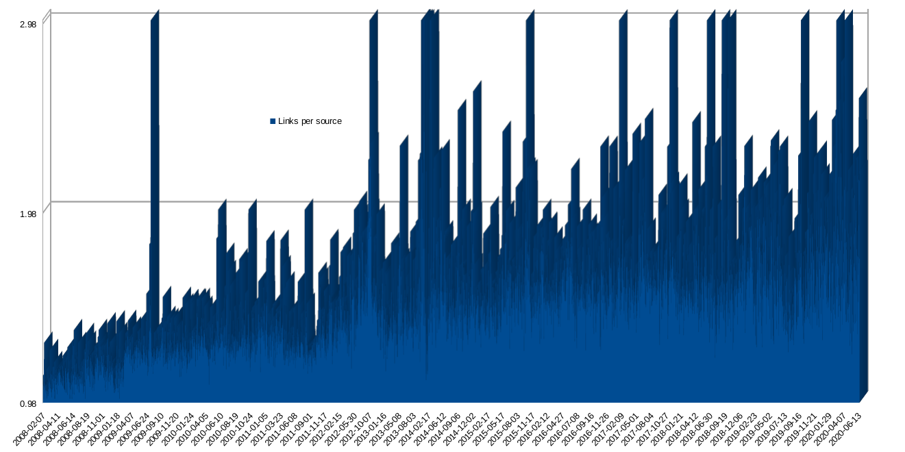

After posting about 3,500 daily batches of links (News Roundups or Daily Links as we call them) we've decided to carry out an analysis and produce some statistics based on these. The code is in Perl, the data is extracted using SQL, the charts are produced using LibreOffice (with OpenDocument Format, imported from CSV files). What the chart below shows is the number of links posted each day, over time, alongside the number of unique sites; the ratio between those two things is shown separately in the second chart.
As more sites perish, especially more trustworthy ones, we're generally left with fewer unique publishers to link to.
 Out-of-range outliers left out of shown boundaries