
Improving Clarity When Presenting LLM Slop and Slop Images
Some ~2 weeks ago, shortly before our journey down south, someone said - correctly we might add - that our stamping or labelling of slop sites was not always easy to see/read. There are occasional issues with colour contrasts, which can typically be overcome by outlines, shadows, or a combination of colours (palettes).
Today we are experimenting with some improvements and the latest iteration looks a bit like this:
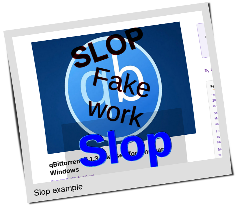
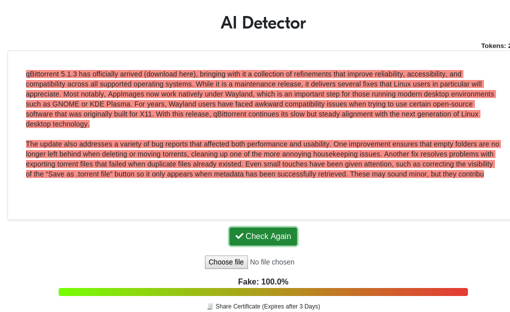
Real example, new examples. Of course it is slop, as usual from Brian Fagioli (a real article was posted by Marius Nestor some hours ago).
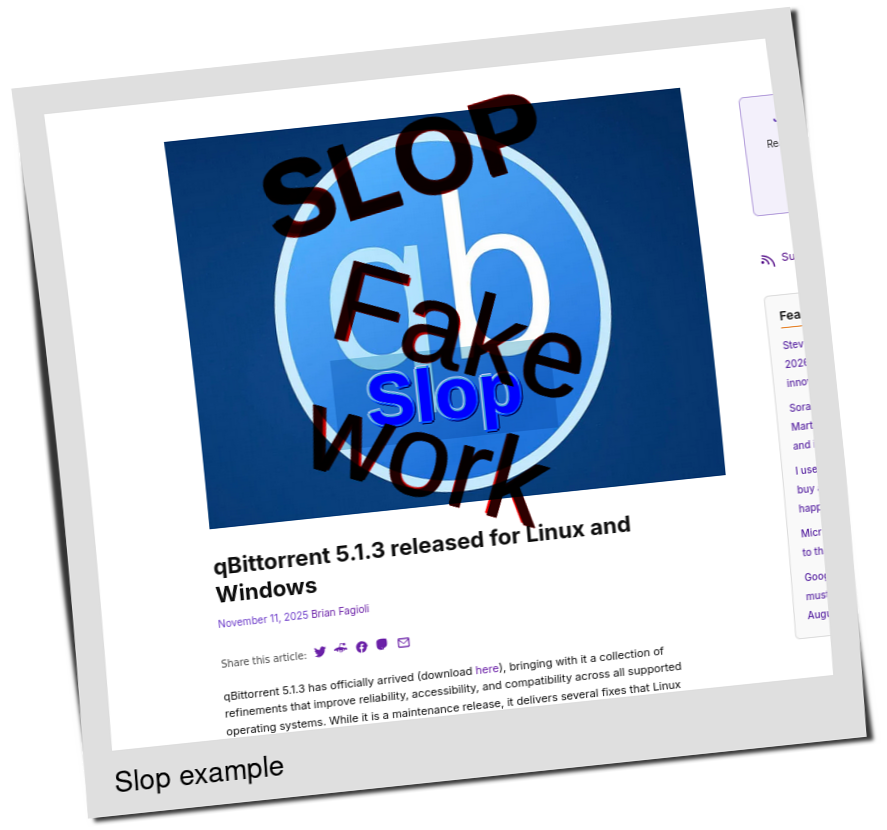
There will likely be more changes (improvements) to improve the visibility of our labels.
As noted earlier today, what we do here does help discourage slop; we have many "success stories" (sites that quit doing this due to our criticism). █