THIS Web site turns 13 in a few months (November) and it will, at that stage, have published about 26,000 blog posts (that's an average of about 2,000 a year). The daily links have been around for more than a decade and the same goes for our IRC channels. Thankfully I still have a daytime/nighttime job to help pay my bills, including this site's bills. I'm personally losing money -- not just time -- on the site. But it's worth it. The site's goal/work is important, as almost nobody else does it (Groklaw did it for almost a decade), and it's rewarding in the fulfillment sense. I sort of live for it.
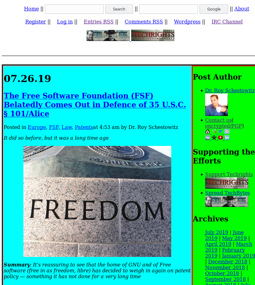
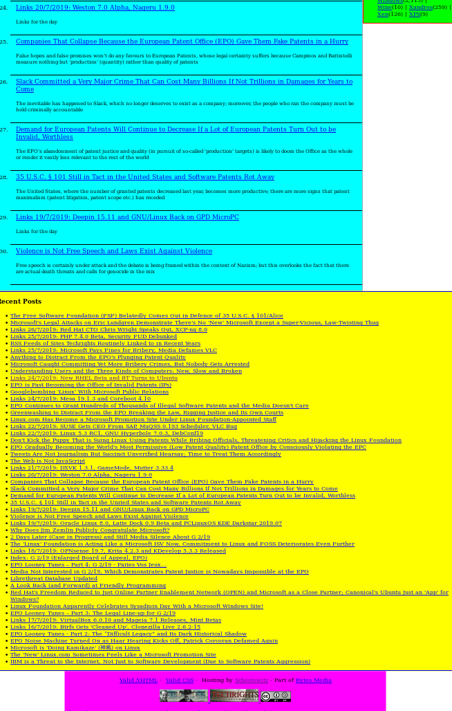
"I'm personally losing money -- not just time -- on the site. But it's worth it."Recently some readers suggested changes to the site's layout. We've had lengthy discussions about these (those are actual, working Web pages, but we're showing just screenshots of these because they're crude prototypes, nothing beyond that). In the interest of transparency and spirit of collaboration we've decided to do a quick (but possibly lengthy) blog post about it. Just to keep readers 'in the loop' and invite feedback. There's more in IRC logs when they become available (soon, some time next month).
To us -- and to me personally -- what's most important is the substance, not presentation, but poor presentation can harm a site. I don't judge sites by their appearance but their contents; if you're promoting all sorts of "alternative medicine" and "survival kits" and "gold bars" in the side bar, that's an instant credibility loss. If you use words like "fuck" and "asshole" in an article, that too can be a problem (depending on the context). If there are no links in the article, that alone might not detract from the message, but it helps to have ways to verify and trace individual claims back to sources. It inspires confidence. When dealing with companies that spent billions of dollars on PR it is inevitable that "shoot the messenger" tactics and nit-picking will be leveraged to dismiss the message. People have been defaming me, even using imposter accounts (with my name), for nearly 15 years.
Due to the size of Techrights (total number of pages) it has been exceptionally challenging keeping everything up to date, up to standard, consistent etc. But we try our best given our limited capacity. We recently got more volunteers. We're very thankful. They're part of us. They're the family. We're growing.
"In the interest of transparency and spirit of collaboration we've decided to do a quick (but possibly lengthy) blog post about it."Anyway, about layout...
"I've taken a few hours to make small modifications on Techrights stories web page," one reader told us, "as we chatted in another dialog. These examples are very ugly, and of course are not intended as anything but a proof of concept. In fact, I'm not sure if I fully like them even in concept. So please feel free of [sic] not liking any of it either. But I wanted to give it a try anyways, in my little spare time. Who knows... maybe they end up triggering some actual good idea eventually. [...Y]ou'll find 4 html files."
It is based on the saved "/?stories" page from that date.
"Then there are three other versions of it," the reader explained. "They use the same assets (as they're all just an edited copy of the html file), and every one has a different modification..."
- "v1" reacts to posts given its height. When height > 1000px, there's a script that limits the post height to 1000px, adds a little gradient at the bottom, and a clickable div for expanding the full content.
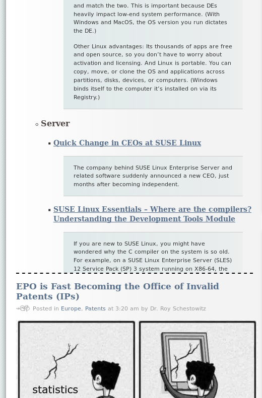
- "v2" does the same, but instead of expanding the contents, the div just opens the post url (given in the post's title) in a different tab.
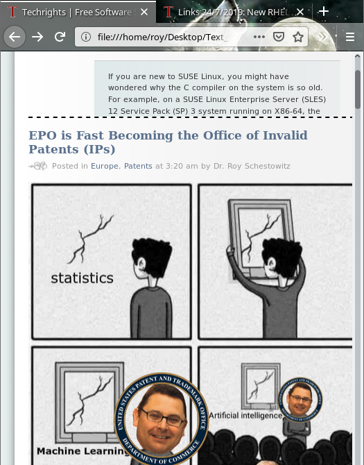
- "v3" shrinks the posts to 100px, without checking its height, and adds a div on the post's top-right corner for expanding it or folding it.

"Of course this is all client-side," the reader noted, "even when there's no need for it (as in "v2", or the css classes assignation). The point is just to toy with the idea of scrolling and being able to focus in what I want to read, without trying to go to a "fully personalized" privacy nightmare and/or a 20MB webpage full of unwanted assets, invasive behaviour, and obfuscated javascript. Just tiny tools that should not break anything and could make it better for someone. By trying this stuff, I guess using desktop I liked more something in the lines of "v1" or "v2", but liked more "v3" on a cellphone. There's something about the tiny screen and not having too much data in it that feels adequate, but not on the monitor. It would be nice to not have this dialog in private, as I believe a lot of readers may have cool ideas."
"To us -- and to me personally -- what's most important is the substance, not presentation, but poor presentation can harm a site."We've passed that around internally last week. "I haven't looked in detail," one person remarked, "but in regards to layout it is 100% possible to avoid any and all javascript and use only pure CSS. If it is a matter of 'bling' quite a bit can be done with CSS3: There are accordion menus, pull down menus, and many other things possible with just CSS. However, my main concern is the reflow of the columns on smaller, more narrow screens. The [...] v3 at least does not address that, at least not once it has been sanitized and the scripts removed."
The person then named/suggested a better mode: "Here's an example of one site that does 1, 2, or 3 columns depending on the browser's width: https://www.deccanchronicle.com/
"Techrights needs to be able to reflow like that. HTML 5, which should also be used, has "summary" and "details" elements for hiding or revealing additional material. There are work-arounds in CSS for HTML4, but HTML5 ought to be the standard used. Working with WordPress to make those kinds of changes will be the hardest part."
This is still work in progress and IRC logs, which we publish once in 4 months (for efficiency's sake), have more on that.
"When worked on those files," the reader added, "my stronger doubt was: "What are the most important issues to tackle here?". And that's very subjective, so I needed your feedback to know it: it's your site, and there are lots of readers. I didn't want to be many hours tunning/designing/refactor not-my-web with only my criteria. And that was specially uncomfortable on the "styling" front. Also, didn't wanted to let the whole thing die without doing anything. So, some dirty sketches sounded like a good start, without needing to tackle all possible ideas at once, and without needing to touch a single given style. If that kind of work were well received, I was about to work next on the styles, which includes the flow, but also things like the font size given the screen size, the distribution of the posts, things like "night mode friendly", and so on."
"This is still work in progress and IRC logs, which we publish once in 4 months (for efficiency's sake), have more on that."Longtime readers are probably aware that the site's looks have been virtually the same since 2006. This is intentional and it assures consistency (e.g. the looks and layout of old posts, of which there are many)
We recently ranted about JavaScript. We don't want to 'pollute' the site with it. It would not help the substance.
"There's also new stuff like CSS grids, flexboxes, and other stuff I never tried," the reader said. "But in my experience, working on a CSS+HTML ONLY solution (which I always try to do) ends up in LOTS of quirks convulting the code, or in sacrificing something for the sake of purity. Things like the box model, pixels and margins that renders differently in different browsers, and so on, end up generating weird scrolls, broken lines, overlapped items, and stuff like that. On my blog I refused to program a reflow, because I couldn't care less about mobile browsers, and it just adapt to screen size; I just zoom with the fingers if I happen to read it on mobile, or just flip the screen. It's not a big nor a news site. So it barely uses any javascript, it has my own personal bling that pleases just me, and works well enough. Wordpress didn't make it hard for me to program it. [...] Techrights deserves a professional work. That means no trash code, no CSS whack-a-more against heavy HTML, no gratuitous javascript, and yet good SEO and good compatibility with other tools. That means lots of work. And neither you or the readers shouldn't do that without a clearer idea of what should be done."
"We're open to the idea of making changes site-wide provided they're sufficiently beneficial and the benefits outweigh harms associated with backward compatibility."If anyone has ideas, please share them with us in the comments, in IRC, or bytesmedia at bytesmedia.co.uk (shared inbox). We're open to the idea of making changes site-wide provided they're sufficiently beneficial and the benefits outweigh harms associated with backward compatibility.
Another person has meanwhile created a prototype without JavaScript and explained: "I agree with most of that except regarding the importance of CSS. In my experience it remains the only way to keep the pages light weight. However, to do that, it does have to be written by hand and not use any off-the-shelf libraries. As for the flow and for stripping extraneous material, see the [following]. Don't mind the background colors or the borders, they are there to show the blocks used." Prototypes are shown below (as screenshots only, as the underlying code isn't polished). ⬆
