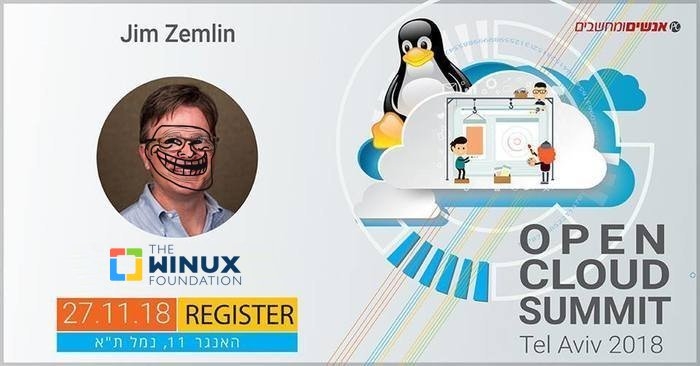


TODAY'S Linux Foundation is nothing like whatever it was 12 years ago. Everything it touches turns to something else. How does one explain to people that both "Linux Foundation" and "Linux Dot Com" aren't pro-Linux and are in fact not run by people who use and care about Linux? One reader of ours was "perfecting the logo," in his own words, producing what readers can see above*.
"We are growingly concerned that Mr. Zemlin loves Microsoft more than he loves the actual GNU/Linux community, including people who use it on their desktops/laptops."This whole thing clearly shows just how far or how much the entryism has progressed. The above event included WhiteSource as a prominent speaker. It's an Israeli firm (like Snyk, another Israeli firm similar to it) and Microsoft is their partner; Microsoft loves them, what's not to like about a company whose whole business model is badmouthing FOSS? It's like Black Duck. We've occasionally mentioned these firms in our daily links, but rarely did we dedicate full articles to them as it would only earn them publicity and fame (which would prove detrimental). It's Black Duck all over again (after a larger firm took it 'in-house') and there's a whole bunch of them, all closely aligned with Microsoft and constantly amplified by a longtime FOSS basher [1, 2, 3, 4], Alan Shimel, who gleefully syndicates all of their blog posts and interjects these into Google News through Security Boulevard (his site, founded to be a megaphone of that anti-FOSS agenda).
We are growingly concerned that Mr. Zemlin loves Microsoft more than he loves the actual GNU/Linux community, including people who use it on their desktops/laptops. We heard that he views the latter as more of a nuisance and a liability.
To quote Linux developer Matthew Garrett (Google), as per his "tweets" (however informal but crude enough to show how he feels):
https://twitter.com/mjg59/status/907000812131385344
https://twitter.com/mjg59/status/907023677887209473
"You cannot teach a python to become friends with mice," I wrote yesterday. "There's this thing called "competition" in capitalism and Microsoft COMPETES against Linux. Microsoft loves Windows. We cannot "love" Microsoft. If they cannot destroy us, they'll try to hijack us."
Does Microsoft even understand love? Is it capable?

Nope, not really. It can try to emulate "love" if that helps Microsoft destroy us all, e.g. by seizing control over the Foundation that now controls "Linux Dot Com" and use that control to appease regulators, thereby buying millions of repositories (a hostile takeover -- hostile towards the developers -- of GitHub). ⬆
________
* There's a background story to it, as per the reader who crafted the logo. He said that "if you are interested in perfecting the winux logo, here are things to consider: the winux logo has the following lines in the same position as before
1. the logo itself
2. the word "the" did not move
3. the word "foundation" did not move
4. most of the word "linux" did not move
"the "w" was added in place of the "l" without moving the rest of the word. This means the "x" is still anchored to the same spot with the "n" in foundation as before. What's changed:
1. the word "winux" is no longer flush with "the" and "foundation"
2. the word "winux" is no longer roughly the same length as "foundation"
And "choices for perfecting the logo:
1. lazy move: move "the" and "foundation" to be flush with "winux" -- this will reduce the standard margin that the text has with the icon/logo. you don't have to resize the background.
2. better move: increase size of image and move "winux" right to be flush with the other text. It still wont be the same length as "foundation" anymore.
3. probably best move: resize "winux" to be same width that "foundation" is.
"You wouldn't have to resize the image itself, you could make all text flush with the original margin, plus now "winux" and "foundation" are flush from both left and right again. Caveat: you either change the aspect (not better) or you change the height and width of "winux" (probably the best option though.)
"Of course you can just use the logo as-is, but these are the basic options to improve/perfect it."